
The Bentway — Identity & Wayfinding System
Objective
Cities are reimagining old industrial infrastructure and transforming it into pedestrian-friendly public spaces. For this project, the objective was to develop a complete visual identity and wayfinding system for The Bentway, an urban park located beneath Toronto’s Gardiner Expressway.
The system needed to support navigation, accessibility, park zones, public amenities, and digital wayfinding while creating a visual language connected to the park’s architectural environment.
Solution
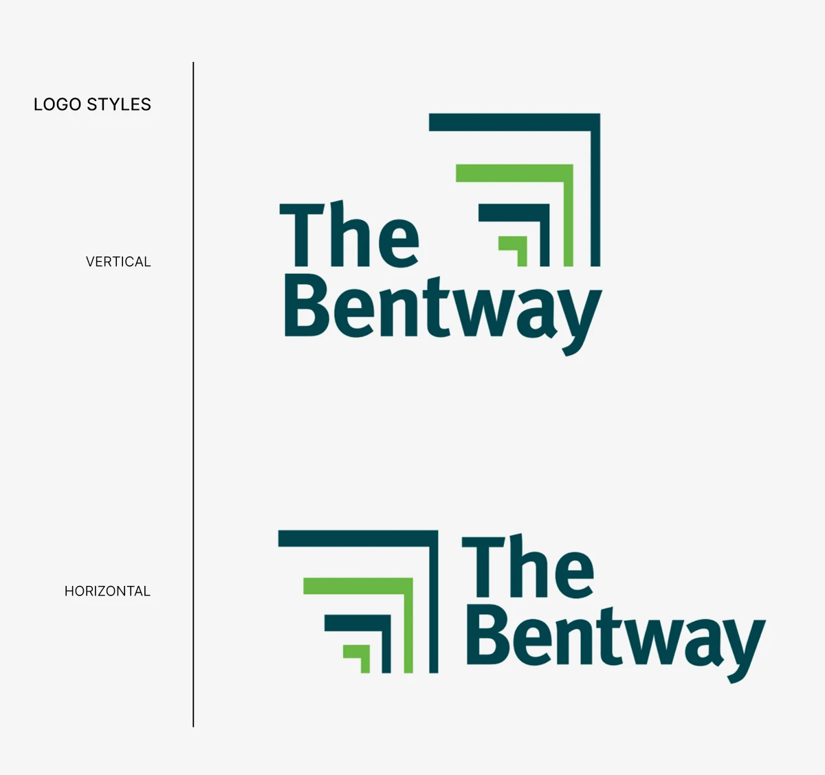
I designed a cohesive identity and wayfinding system built around a geometric logo inspired by the layered structure of the expressway. The mark uses repeated L-shaped forms to suggest movement, pathways, and the park’s location beneath a highway structure.
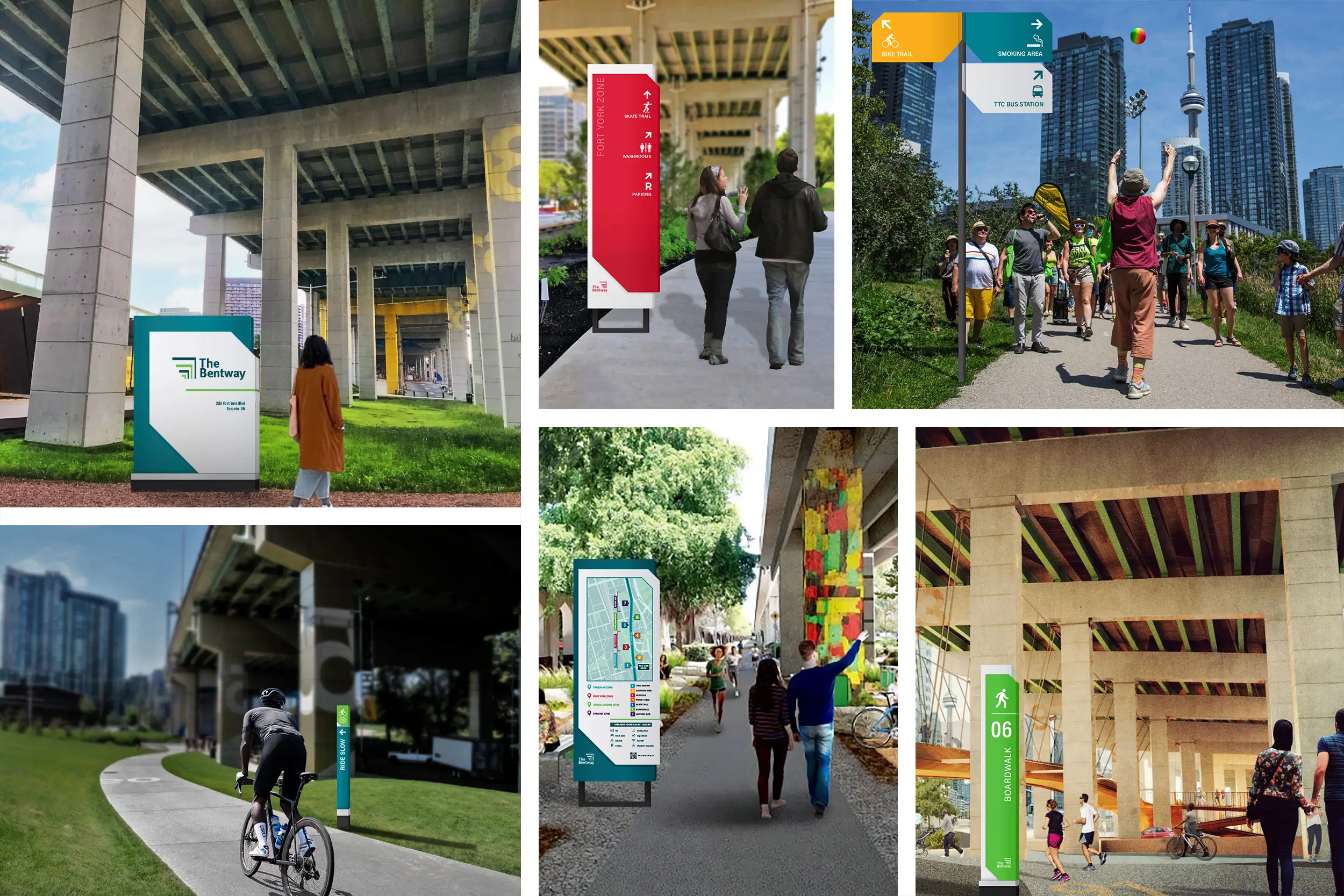
The visual system extended into colour coding, typography, iconography, maps, signage, and a mobile wayfinding concept. Each colour was assigned to a different park section to help visitors understand the space more easily, while the signage shapes and digital touchpoints created a consistent experience across physical and mobile navigation.
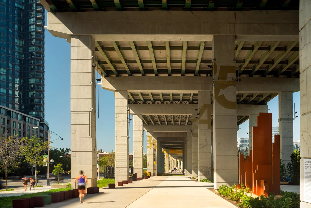
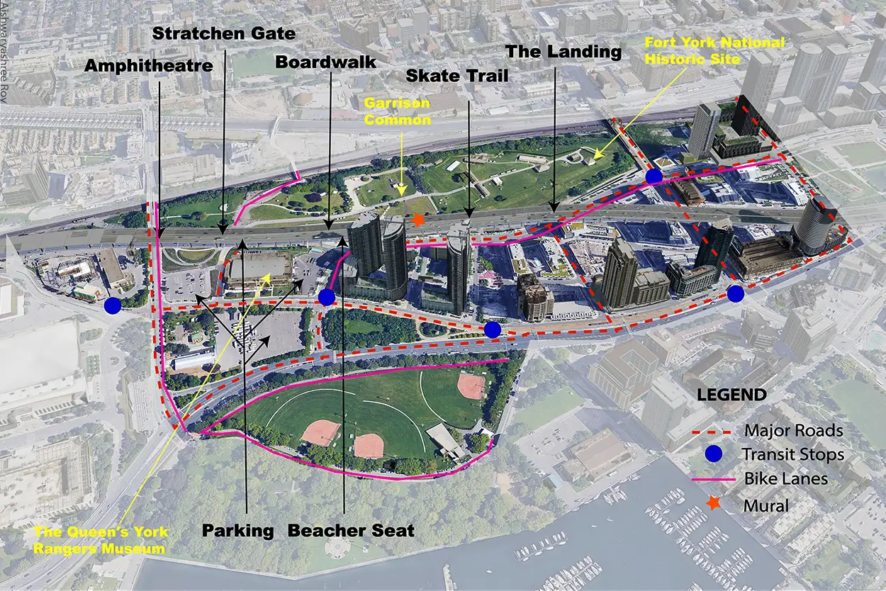
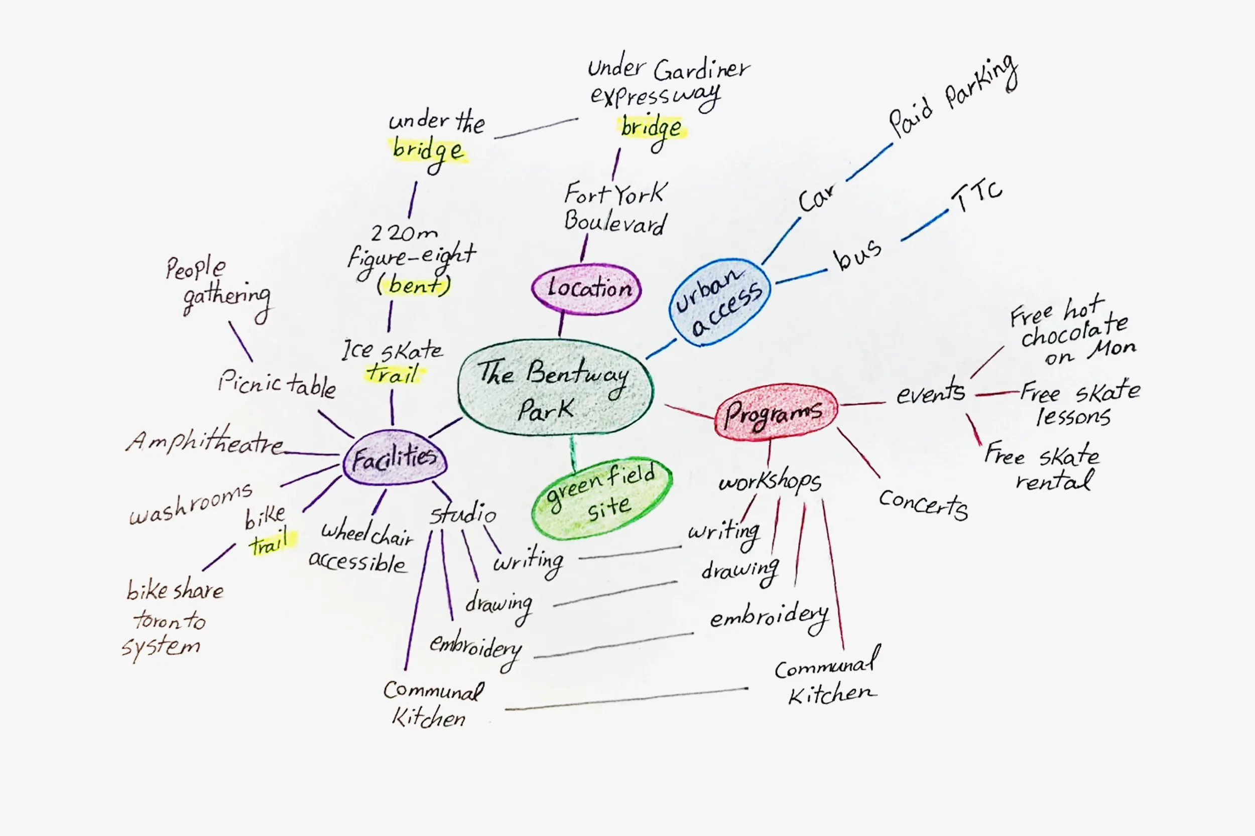
I started by studying The Bentway’s location, surrounding access points, public amenities, visitor needs, and the structure of the Gardiner Expressway. This helped define the main design challenge: creating a system that could guide people through a layered urban space while keeping the experience clear, accessible, and visually memorable.
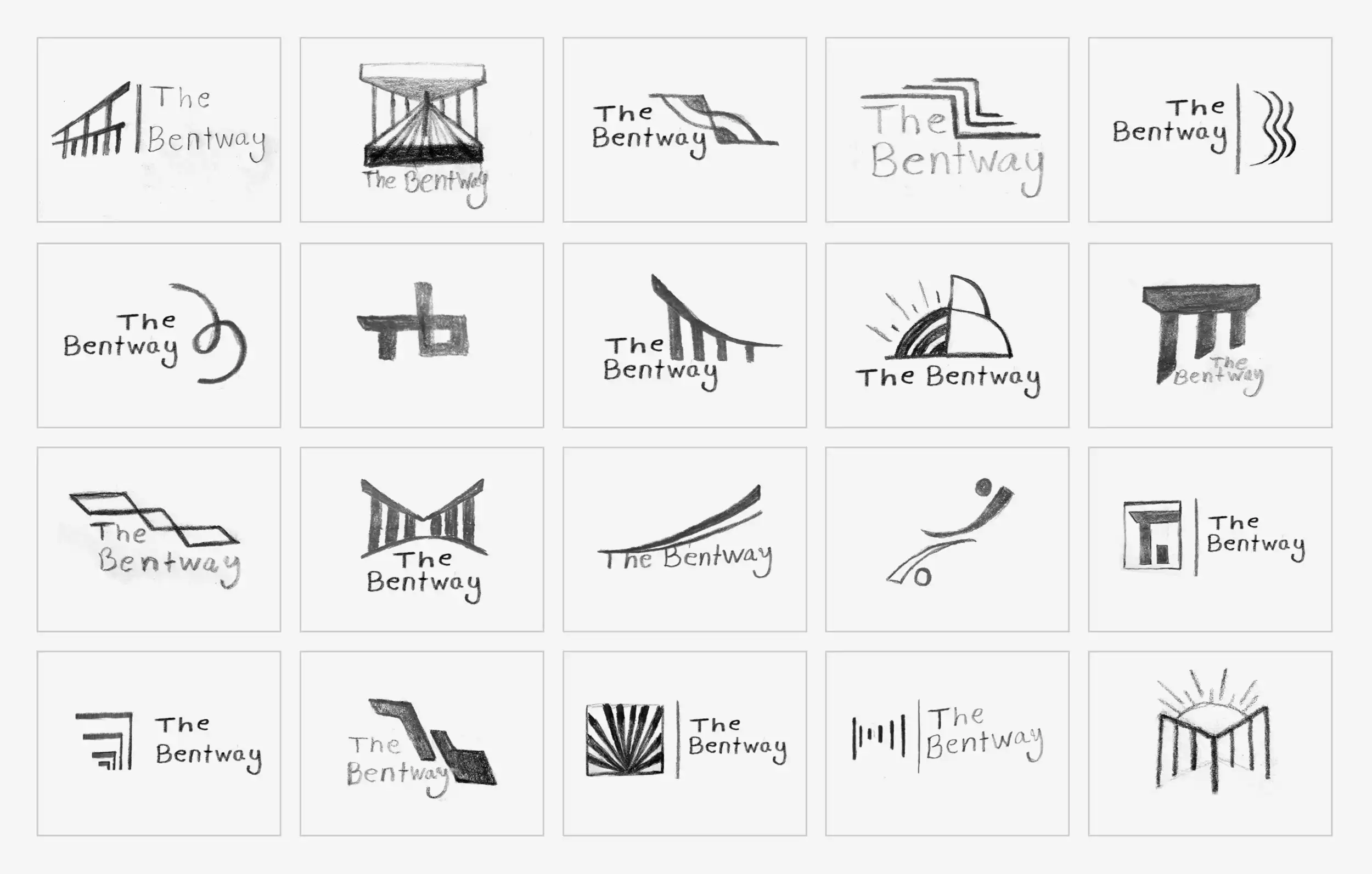
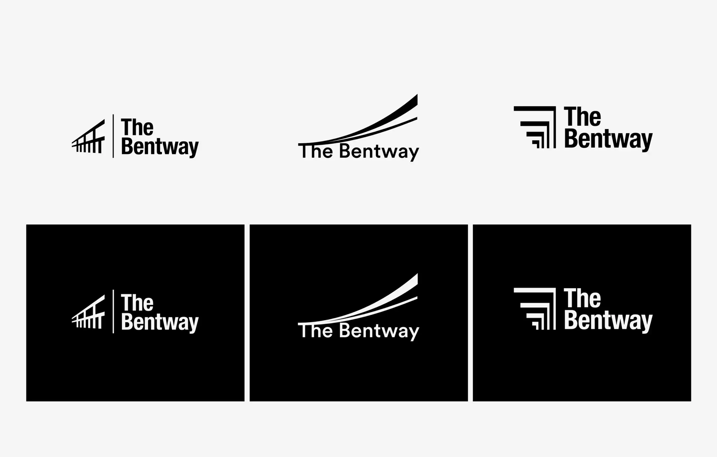
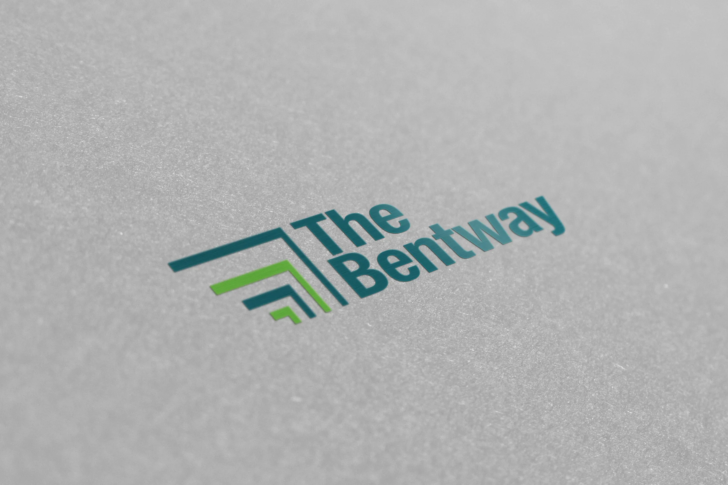
The logo was developed from the architectural language of the Gardiner Expressway. I explored geometric forms, repeated angles, and layered structures before refining a mark based on rotated L-shaped elements. The final logo suggests movement, structure, and the experience of navigating through an urban space beneath the highway.
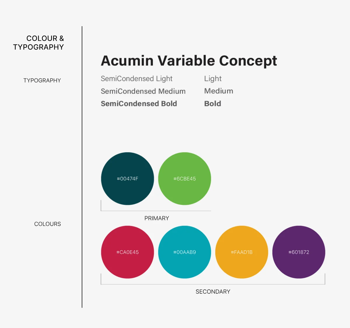
The colour system was designed to support both identity and navigation. Primary colours created brand recognition, while secondary colours helped separate park zones and improve wayfinding clarity. The typography was selected for readability, structure, and compatibility across signage, maps, and digital screens.
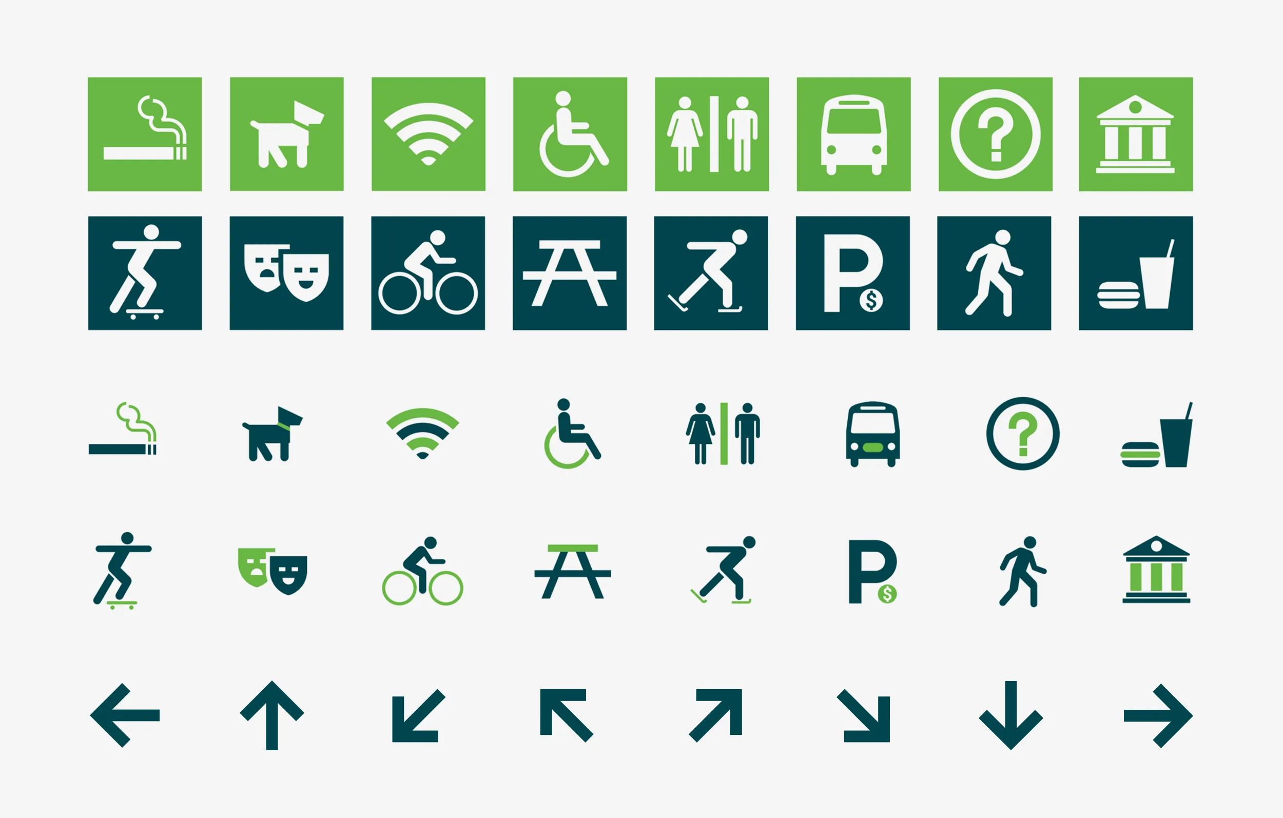
I designed a consistent icon set to support quick recognition across park amenities, accessibility, transportation, recreation, and visitor services. The icons were built with simple geometric forms to stay clear at different sizes and remain visually aligned with the identity system.
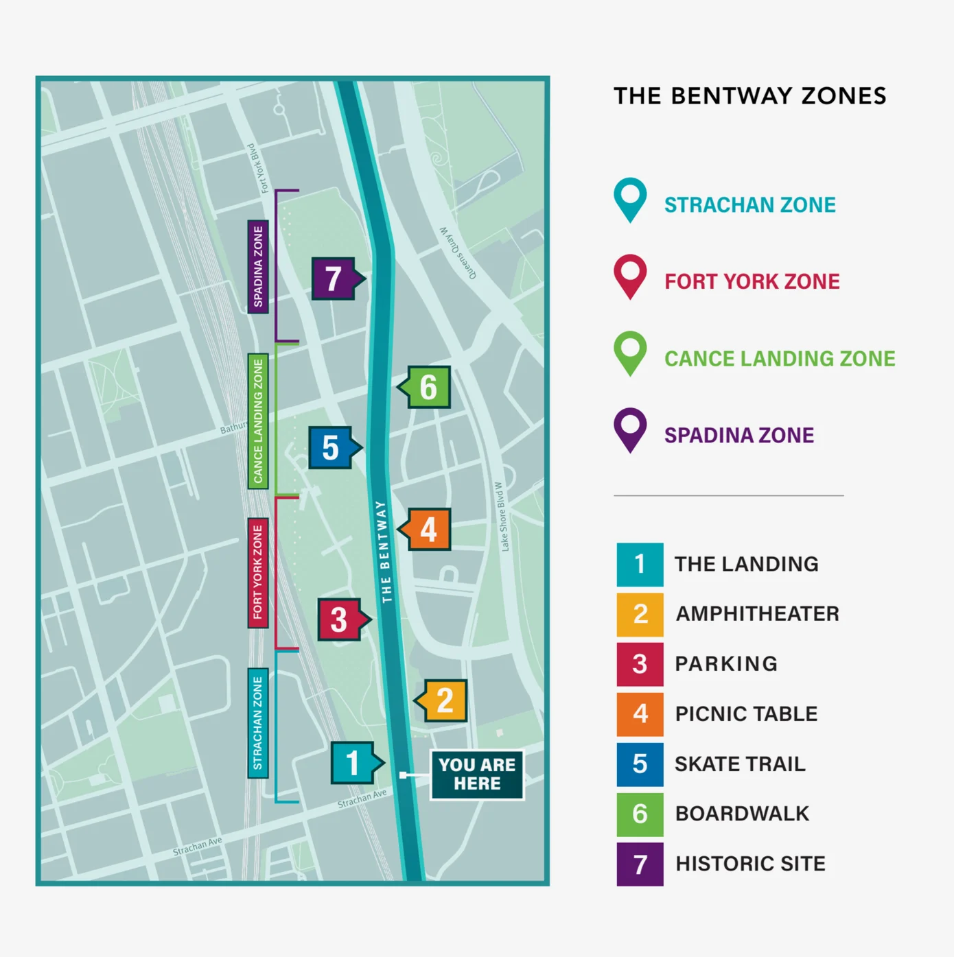
The map was designed to simplify the park’s layout and help visitors understand key zones, entrances, amenities, and movement paths. Colour coding and icon placement were used to make the map easier to scan and connect it visually with the broader wayfinding system.
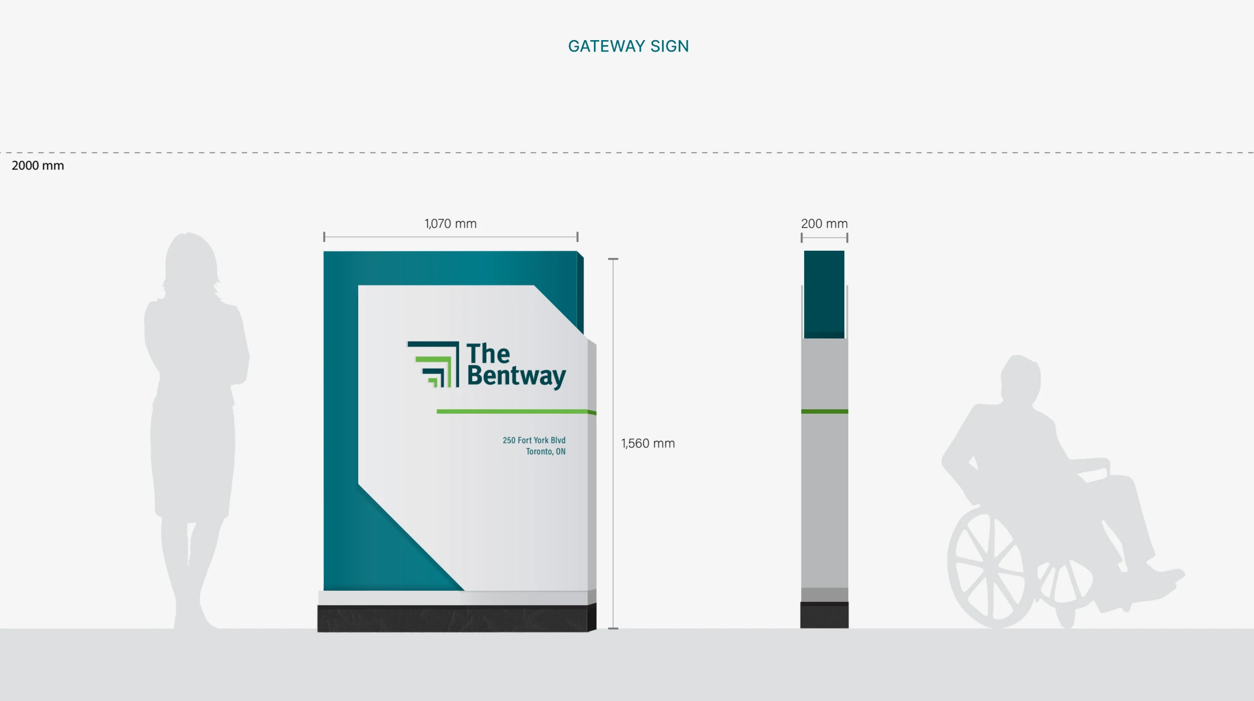
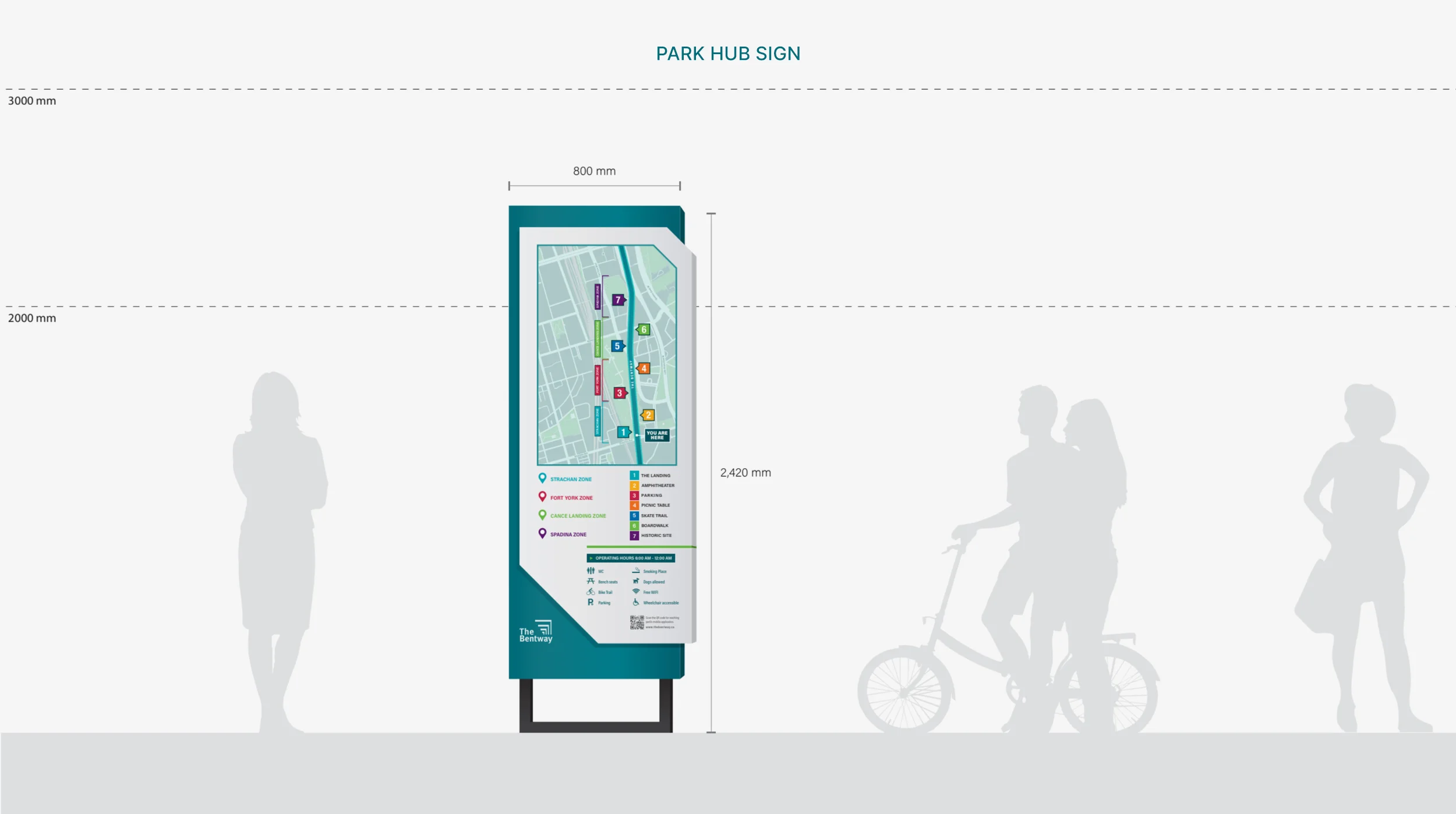
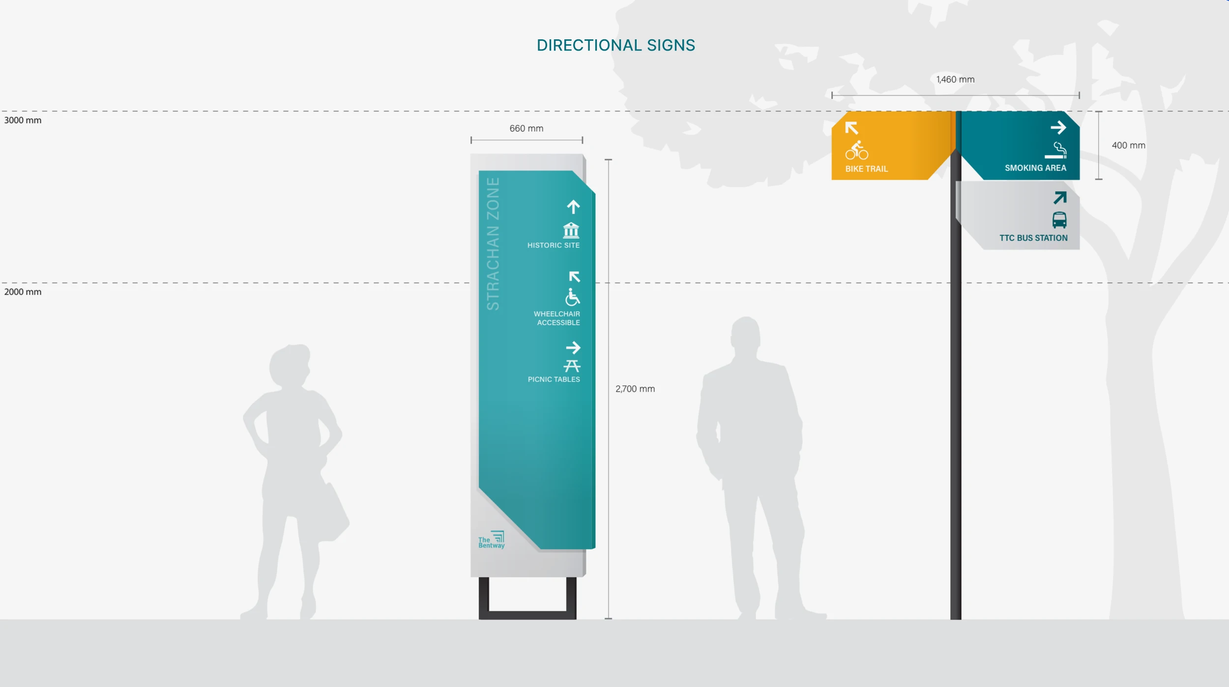
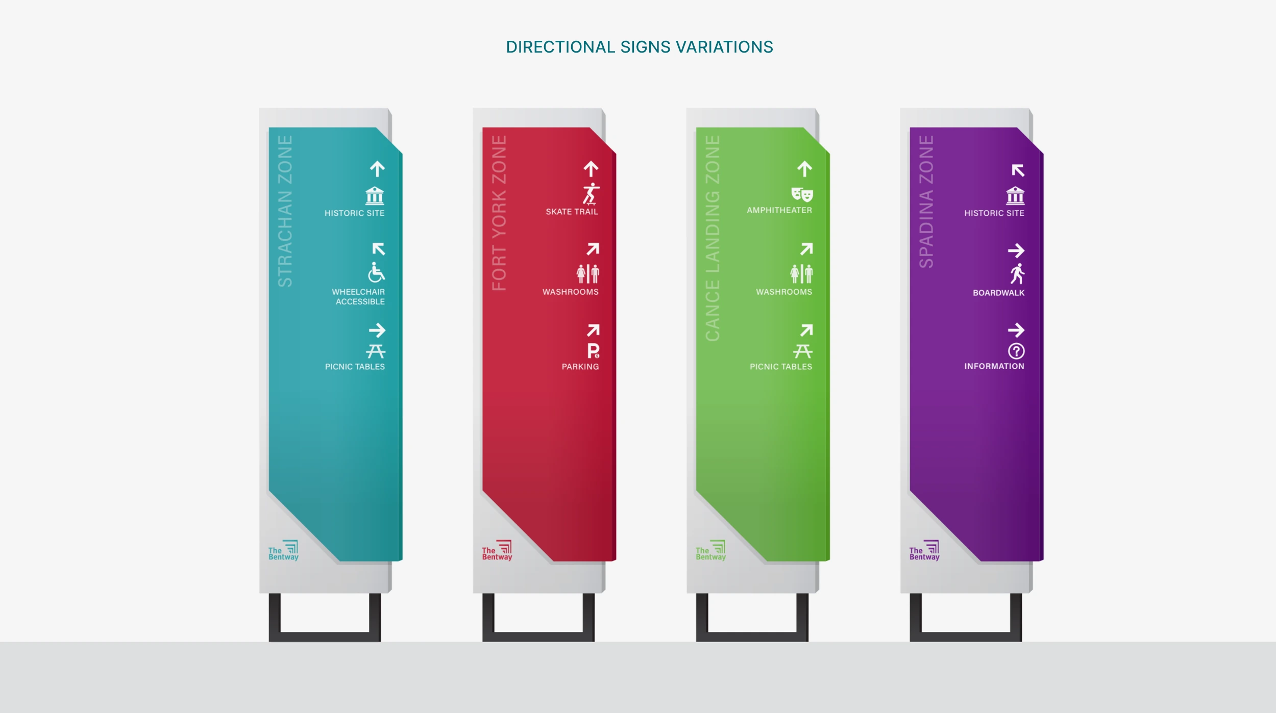
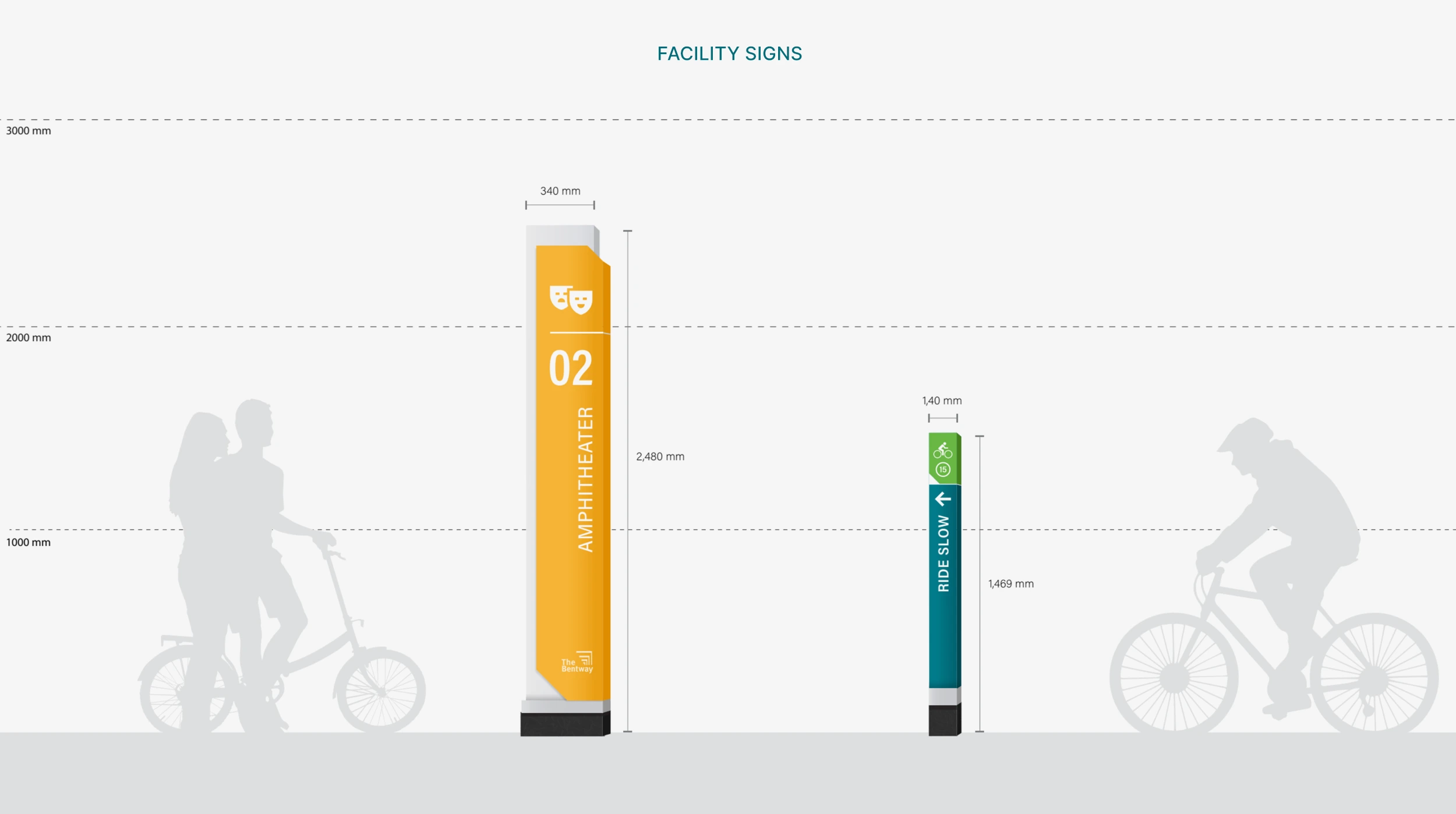
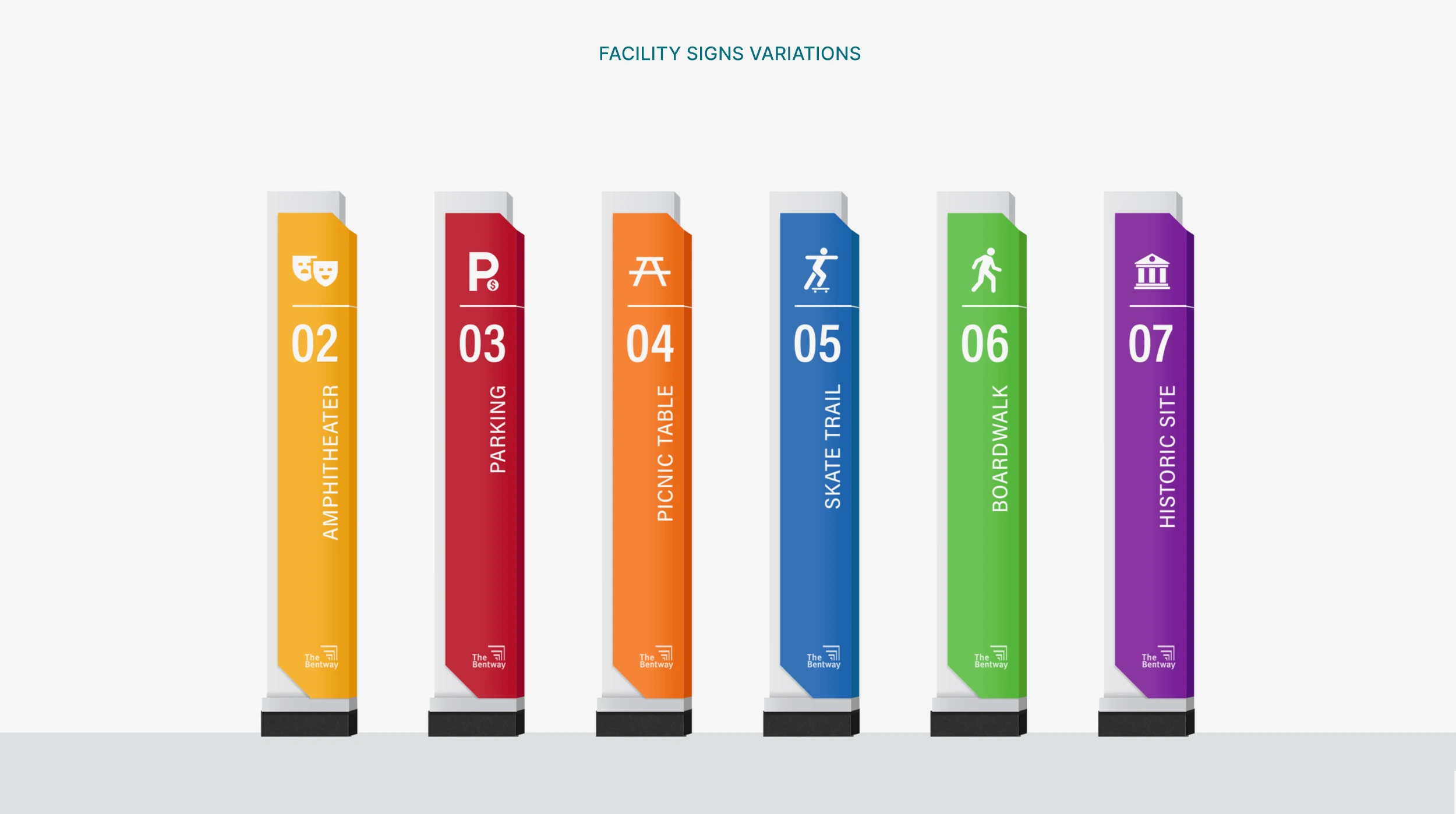
The signage system was developed to guide visitors through the park using consistent shapes, colours, icons, and directional information. Sign types were designed for different navigation moments, including entry points, directional decisions, facility identification, and zone-based orientation.
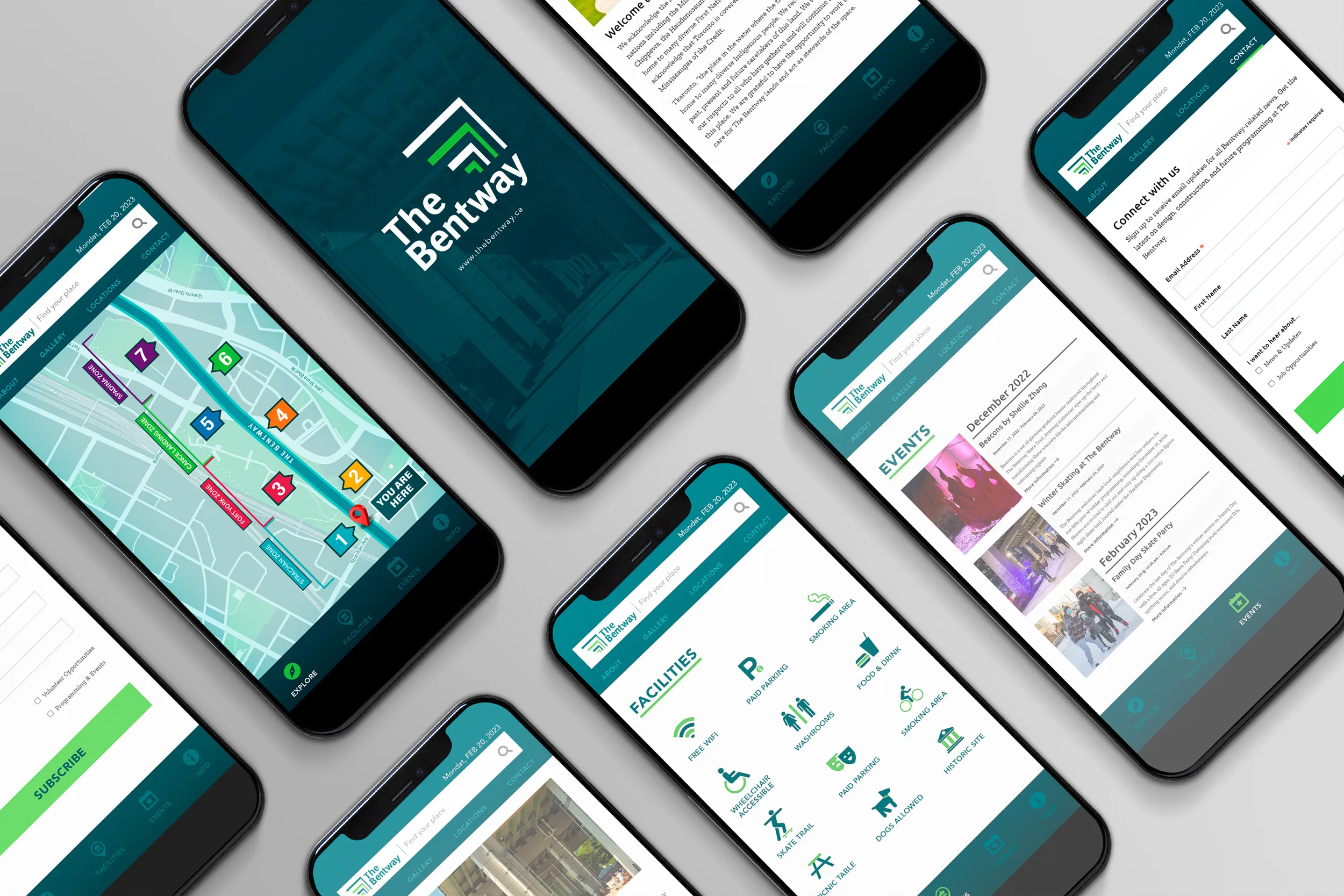
To extend the physical wayfinding system, I explored a mobile wayfinding concept that could help visitors access park information, locate key destinations, and connect signage with digital navigation through QR code integration.