


The Lifeguard Company — Logo & Brand Identity
I developed the logo and visual identity for The Lifeguard Company, along with a wider brand system that extended across stationery, marketing materials, lifeguard apparel, and web design.One of the main challenges in this project was the client’s request for a logo that felt distinctive and symbolic while clearly reflecting the lifeguard field. To respond to that, I built the logo as a crest-based emblem and incorporated visual elements associated with lifeguard services and water safety. The final mark combines multiple lifeguard-related symbols within a shield composition to convey protection, rescue, and professionalism. I also introduced wing forms on both sides of the emblem as a metaphor for guardianship and lifesaving support, giving the identity a more memorable and character-driven presence.After defining the core identity, I extended the visual system into branded applications such as stationery, flyers, apparel, and digital touchpoints to create a more cohesive brand experience across both print and online use.
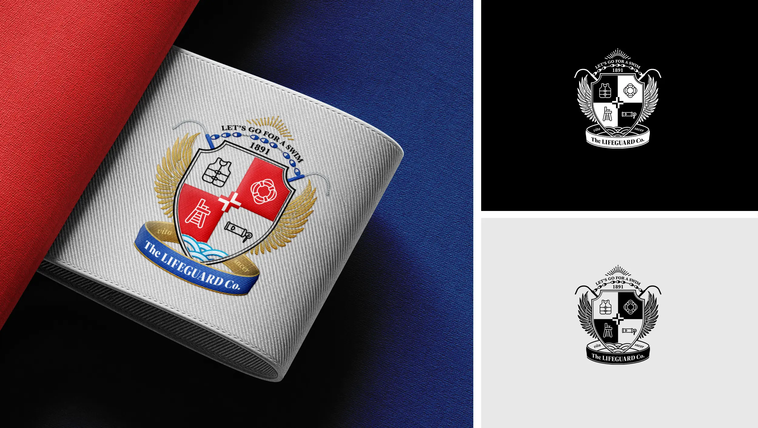
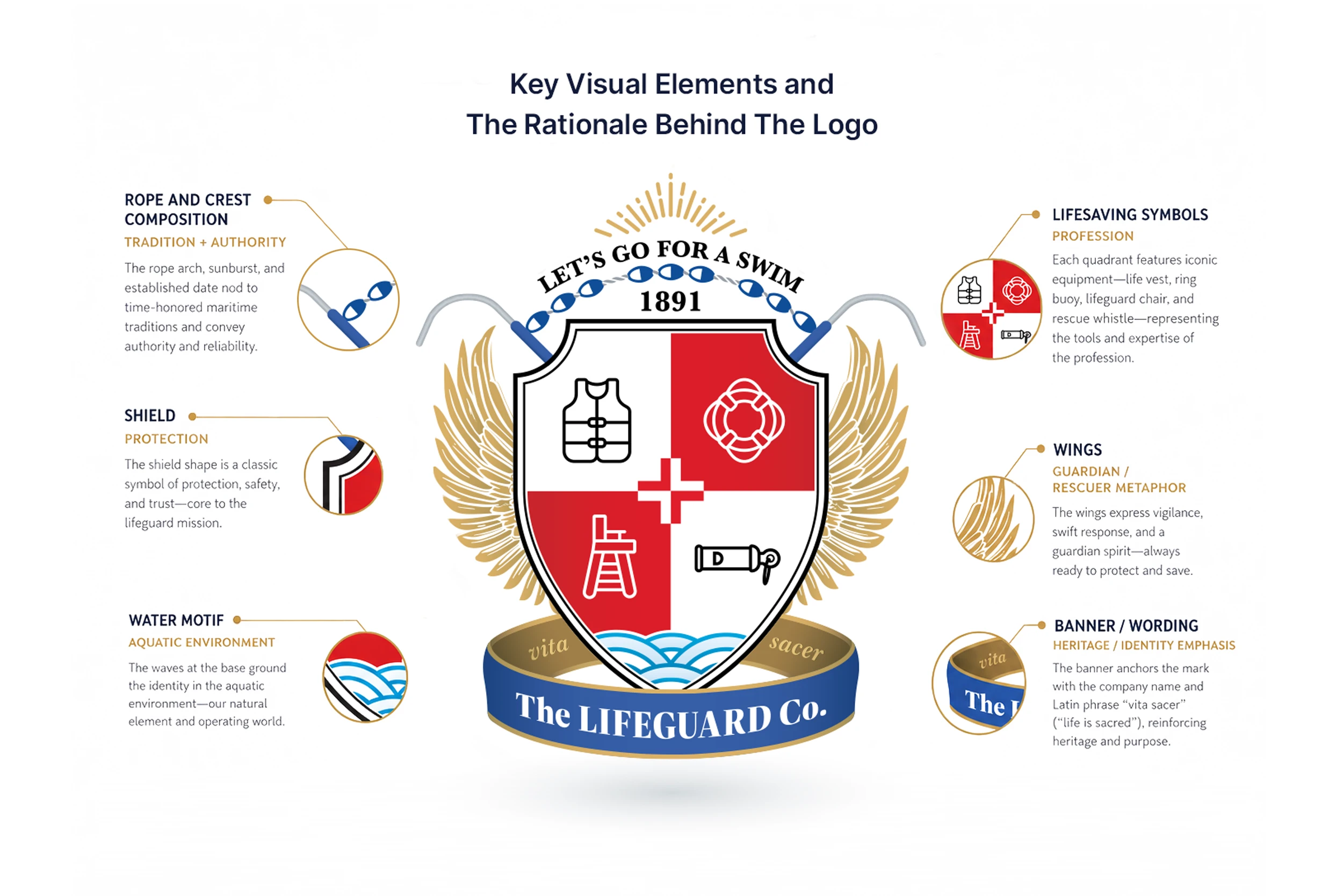
I approached the logo as a heraldic-style emblem to give the brand a stronger sense of identity and distinction. The shield became the central structure, representing protection and responsibility. Inside it, I incorporated lifeguard-related symbols to reflect the company’s field and services. I also introduced wing elements on both sides of the mark as a metaphor for guardianship and lifesaving support — a visual reference to the idea of a rescuer as a protective figure.The emblem was built by combining protection, safety, and aquatic symbolism into a single structured identity mark.
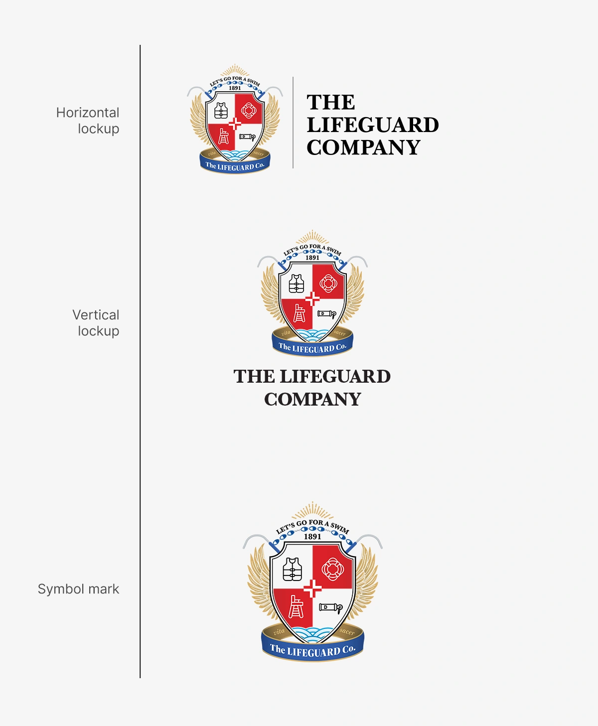
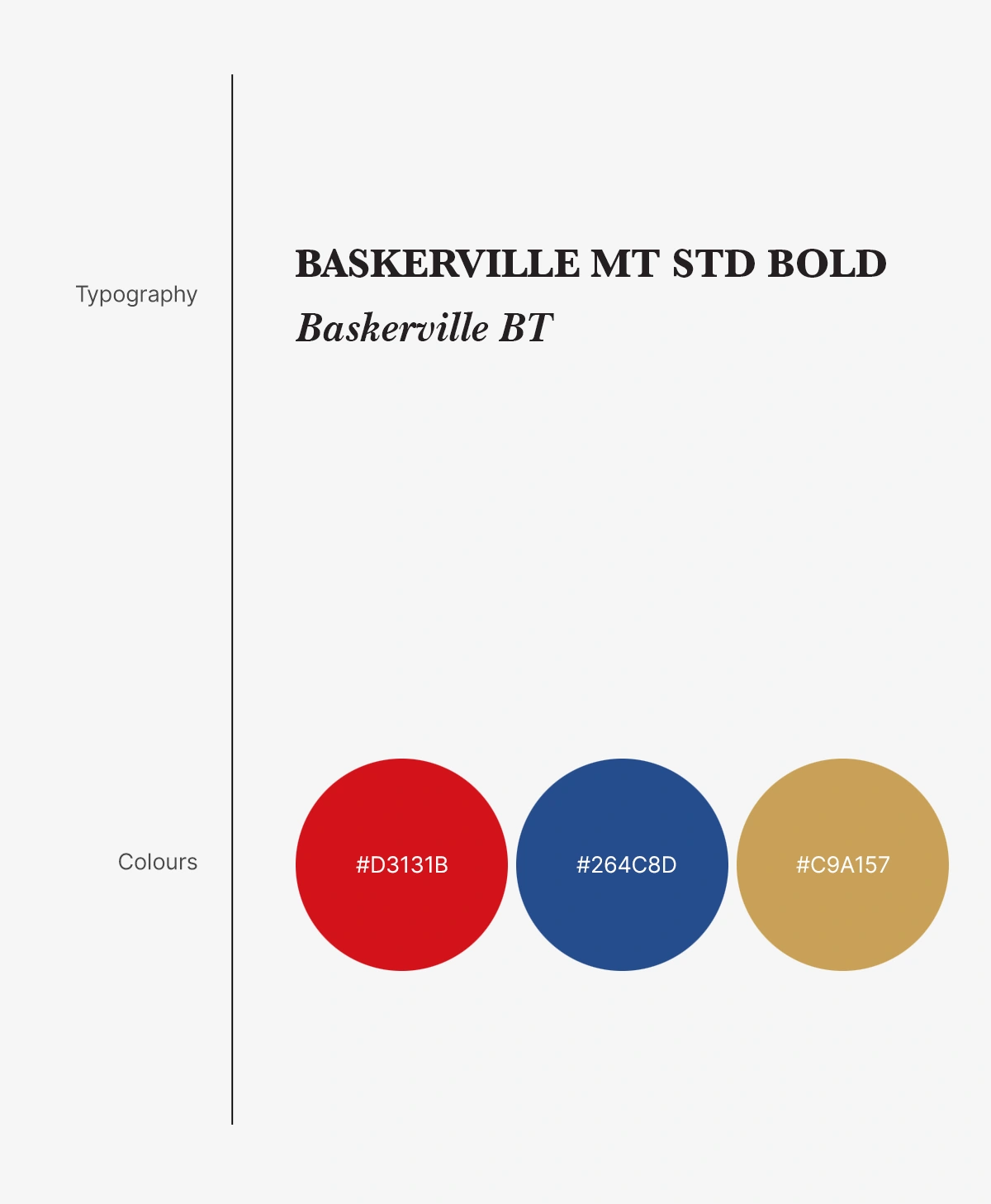
After finalizing the main crest, I built a logo system that could adapt to different layouts and brand applications. I created horizontal and vertical lockups, along with a standalone symbol mark for situations where the full brand name was not required.For the visual identity, I used a formal serif type direction and a focused red, blue, and gold palette to support the brand’s sense of protection, trust, heritage, and authority.
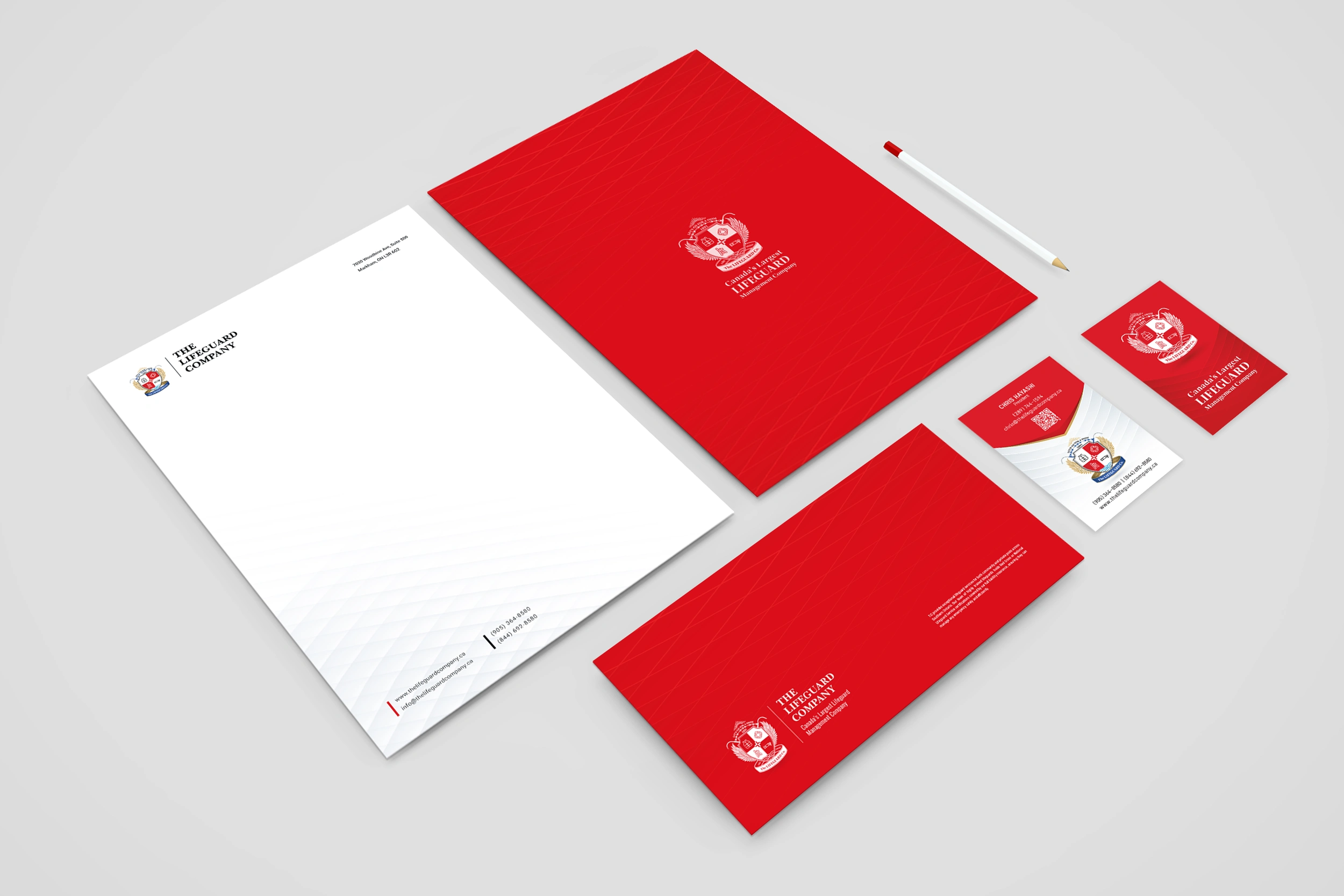
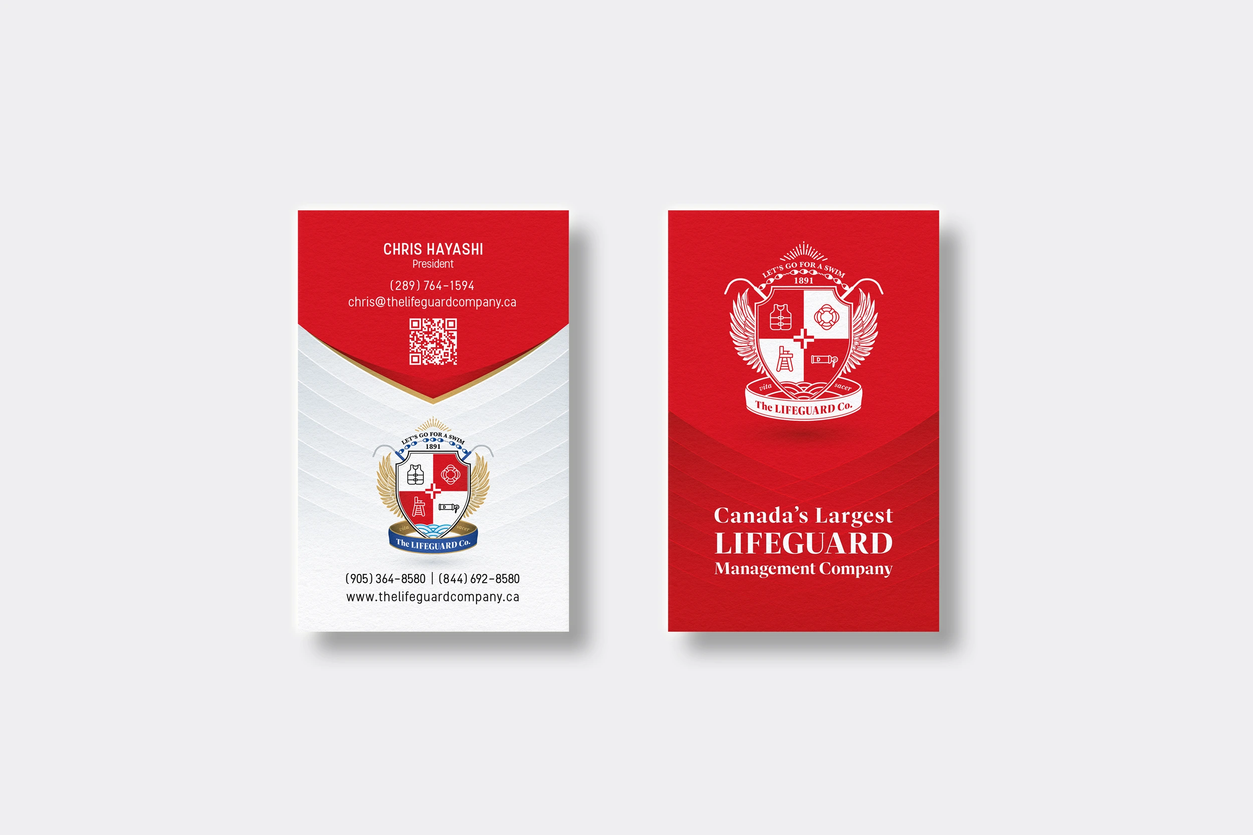
I designed a clean stationery system to balance the detailed character of the logo with a more restrained and professional layout. The supporting graphics were kept subtle so the brand mark remained the focal point while the overall communication stayed clear and practical.
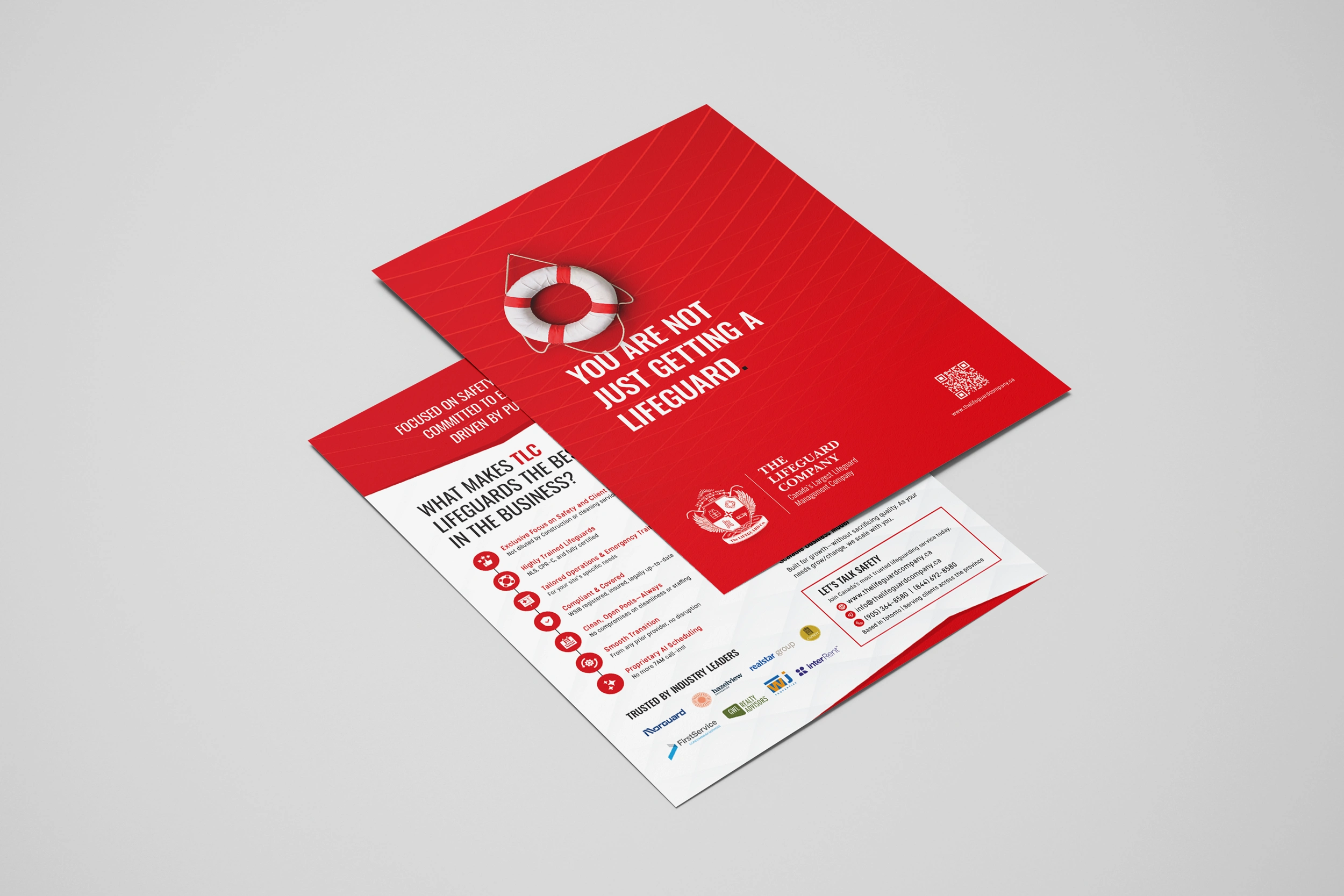
For promotional materials, I adapted the identity into print layouts that maintained the brand’s distinctive character while making the messaging clear and accessible. The goal was to create materials that felt recognizably tied to the logo while still working effectively as marketing communication.
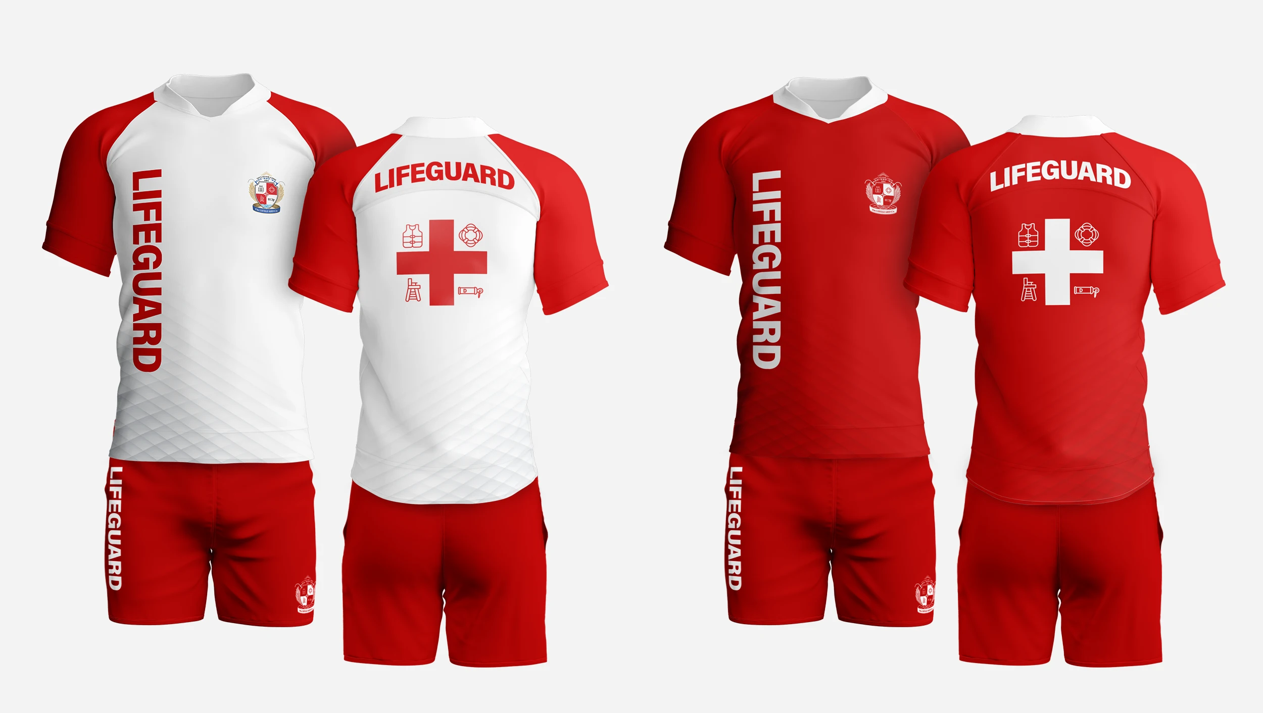
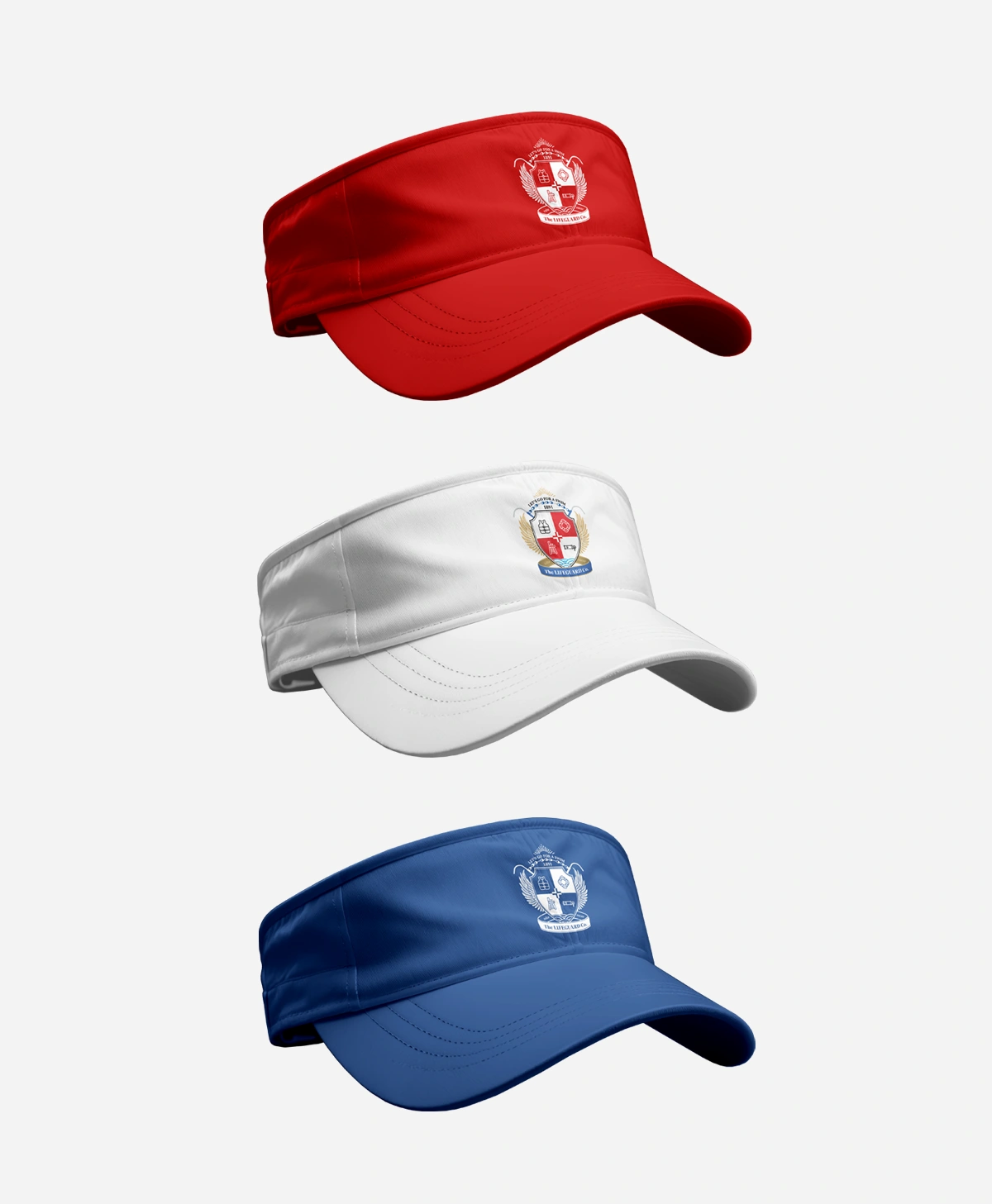
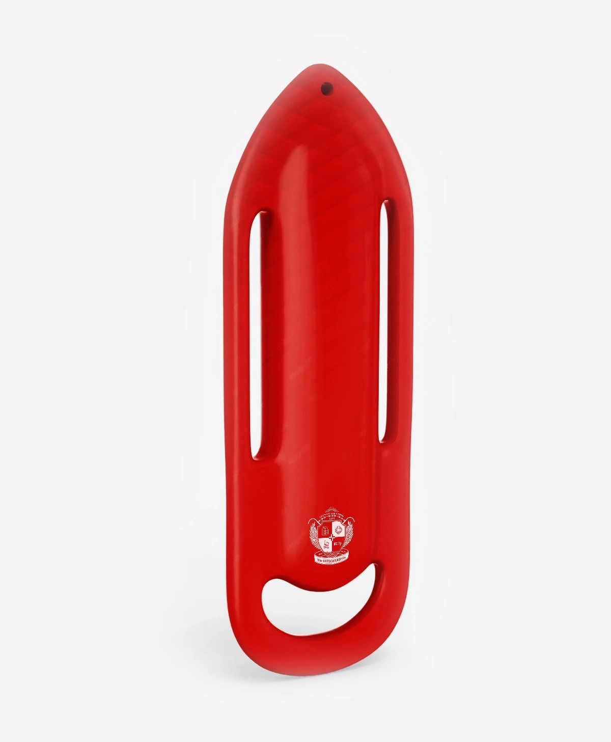
I also extended the identity into lifeguard apparel. This part of the system was especially important because the staff uniform acts as a direct public-facing brand asset. The apparel needed to remain practical and readable while carrying enough visual identity to feel connected to the overall brand.
